
In the wake of my previous studies, proving that winners in cat B-D make a lesser effort than the rest of the podium, as opposed to cat A where winners make a harder effort, a question kept resurfacing in the discussions on the Zwift forum: Is it really reasonable to assume that you can detect cheating (cruising) from just looking at a HR distribution chart?
Coming from the outside it may indeed seem like a fair question. I would, however, like to argue that it is not, that you are missing the point. The point is that cruising is the HR distribution graph. You can’t really detect it any other way, not even in theory. In fact, you can’t really define it any other way. I will try to explain. But first one of those mandatory detours that come with this blog.
I thought we would start off with discussing dead celebrities. Let’s leave the boring Club 27 out of the picture for a change. But do you know who Borg was?

No no, not that Borg. I am referring to Gunnar Borg, PhD MD and former Swedish professor in psychology.
I saw him in person a few times while he was still active since he was working at the same campus I was studying at for some years. He and his colleagues used to hang by themselves in this creepy brick building that looked more like a crematory than an academic faculty. Psychophysics. Supposedly, the house made for a good lab environment, whether they actually incinerated failed students in there or not. We weren’t sure.

Anyway, Borg, who died early this year (from old age, I would presume, after a long and productive life) is a world celebrity in our game. No, he was not a cyclist, but he was and remains the go-to guy when you need to put a measure on your physical efforts but lack data on Watt, heart rate, max heart rate, lactate levels, etc. Or when you want to match physiological measures to a person’s perceptions of what is going on in his body, regardless of whether this person is an elite athlete or someone with a possible heart condition visiting a hospital lab.
Borg is famous for the so-called Borg Chart, widely spread in both sports physiology and medicine. You have surely seen it before. If not in this exact form then at least its elements will be familiar to you.
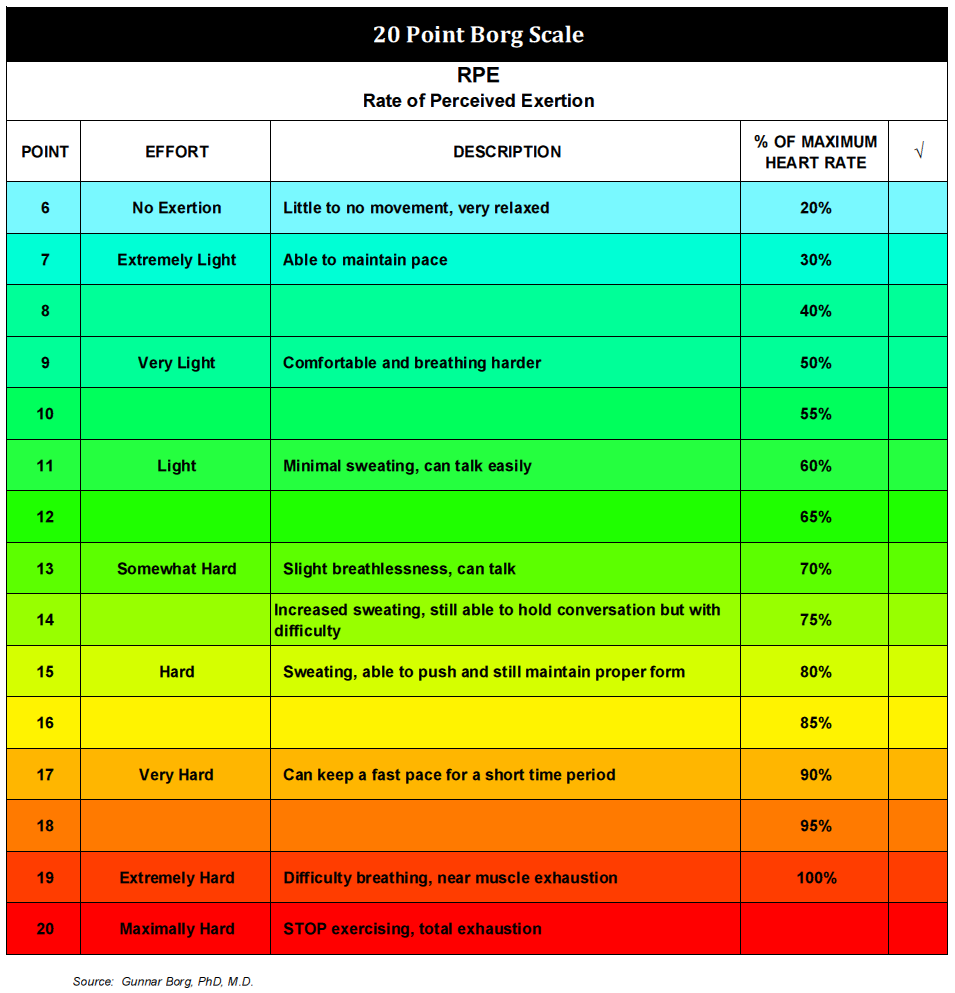
Along with the Borg Chart there is the Borg Scale in which you estimate your physical exertion from 0 to 20, where 20 would be the point of failure e.g. at the end of a ramp test, one where you don’t hold back. The rest should be familiar too. If you look higher up in the chart above you can find the “can talk“, a familiar cue from your recovery or fat burning rides, and so on. Yes, there is a corresponding scale in Strava that you can use when you don’t have a power meter or a heart rate monitor. And it all started with Borg.
On the right you can see the rough percentage of your maximum heart rate that each level of exertion corresponds to. Even though how your working heart maps to your perceived effort can vary a little from individual to individual, there is still a pretty hard correlation between the two. For example, it is very hard to talk at VO2Max (above 90% max HR) for anyone, and it is not something you can get used to or learn. It is just the way our bodies work. Nor can you go beyond 20. There is no “you can always dig deeper, what doesn’t kill you…” when you are at a perceived 20. Max is max, and your legs just stop working.
Obviously, the Borg Chart is relevant when we once more turn to cruising.
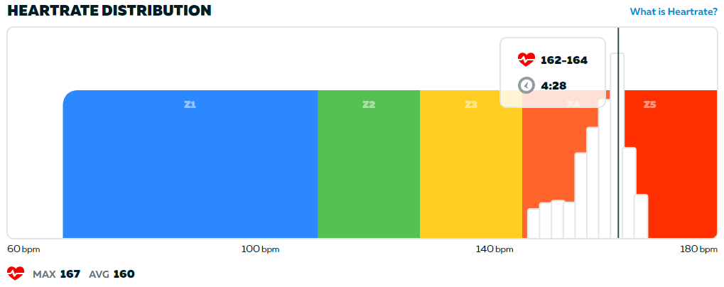
I thought I would show you some examples of HR distribution graphs from Zwift again. The other day I posted a race report. The effort in this race can be summed up as follows:

The green part is the spindown and can be ignored. But look at the rest. Was I cruising this time or not? Couldn’t this be a fairly normal, legit race?
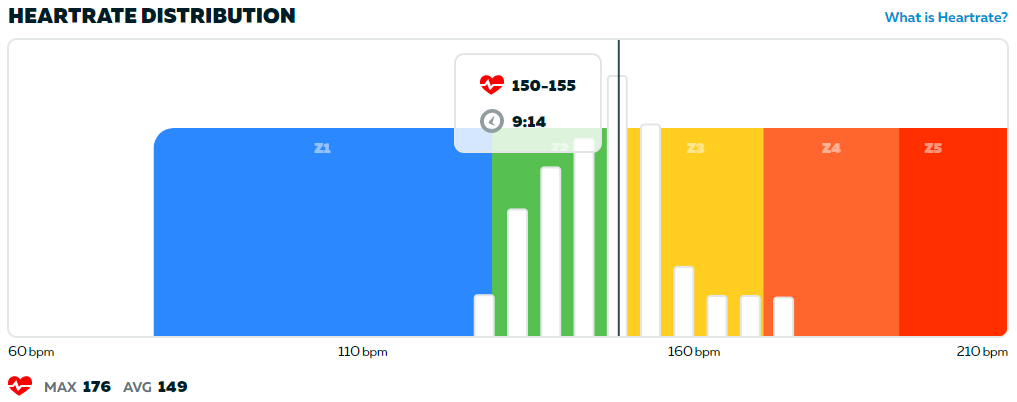
We need a point of reference, something to compare with. Here is another race from last year when I was more fit but also had a max HR that seemed to be a couple of beats lower than today. It’s a 3.2 W/kg effort that still left me well outside the podium in cat C on ZP:
Do you notice any difference between the two graphs?
Returning to Borg, what was the perceived effort in those two races? Let’s start with the second graph. A large part of it was spent above 160 BPM, as you can see. In my case, with a max HR of 173 at the time, this meant 92% of max HR. If you refer to the Borg Chart above this should mean that I perceived a large part of the race as “Very Hard” or worse.
Did I? It checks out. I can attest to that. Or to put the perceived effort in my own words: It was something of a OH-GOD-PLEASE-MAKE-IT-STOP-I-CAN’T-TAKE-IT-ANYMORE-I-WILL-SELL-MY-BIKE-TOMORROW kind of effort (and the day after you are none the wiser).
So what about the first graph? First, I was actively cruising. I had signed up for a D race. I am not as fit today as in the other race, which should have pushed my bars in the graph to the right compared to if I had cruised this race a few days after the first one last year. And this push to the right would also translate into a somewhat higher perceived effort. Even so my perceived effort of the cruiser race was that it was quite easy.
Let’s repeat this AND look closely at the first graph again:
- I signed up to a lower category
- I consciously cruised
- It felt easy
Now let’s look at another rider in a race that I participated in a few days ago. The winner in cat C, according to ZP, looked like this:
It should be noted that this rider is very young, a teenager, so he should normally have a max HR in the 200’s. He has won about half his 30-some races on ZP [sic!]. In this particular race he was followed by a podium that looked like the second of my graphs, the “Very Hard” effort according to the Borg Chart.
You are the jury here. What is the verdict? Make ample use of the Borg Chart if in doubt. Did he cruise? Or does he just have a serious heart condition capping his HR, a condition that somehow still lets him win half his races? (I bet you can beat his win-% easily.) Or was there perhaps just a glitch? Maybe Martians sent some rays that affected the graph? Or maybe he has Martian DNA himself and that this is what a typical low cat winner’s HR graph looks like on Mars?
You are the jury here. What is the verdict? Is it at all possible to separate at least some cruisers from legit racers by merely looking at HR distribution graphs?
You are the jury here. What is the verdict? Refer to the Borg Chart again. Is it reasonable that someone can win half his races while talking to a friend without too much difficulty (70% HR), while other contenders can hardly breathe (90% HR) and all of them, winner included, are at or close to the performance ceiling in the category and would get a DQ if they went any harder? Are the W/kg categories appropriate for a sport?